Hello, I'm Daniel

I've been designing digital products since 2011. I redesigned Kernel's analysis tool for medical teams; I designed Shootr’s Chat service; and I helped to design Telefonica’s Niji.

Before, I enjoyed a few years of cold and northern lights in the swedish Lapland. I studied a master in HCI; I researched about design for unobtrusive interfaces; and I designed for brands such as Benetton and Swedish Television at North Kingdom.

Besides that I believe that technology can have a positive impact in the world. I am passionate for data analysis and understanding new technologies, systems and businesses. I use this passion to invest in or design for the companies of the future.

Currently I live in Barcelona, but originaly I’m from La Rioja, a small region in Spain.

Thanks for stopping by.

Unobtrusive interaction

Transform Medical Insights into Action

Kernel helps to analize feedback from healthcare professionals about treatments and diseases so that pharmaceuticals can improve their products.

In April 2019, it had receded to an outdated and disorganized slew of features that made the experience slow and complex to use. This is the story of how I was part of an ambitious project to recreate Kernel.

I have omitted and obfuscated confidential information in this case study. All information is my own and does not necessarily reflect the views of Kernel.

Kernel

Coming to a crossroad

Back in 2013, Kernel discovered that MSL teams didn’t have an easy way to showcase their most valueable asset: medical insights. They learned that MSLs and Medical Directors were struggling in spreadsheets or CRMs optimized for Sales. By 2019, Kernel website and mobile app were used by over 50 MSL teams spread across 30 countries.

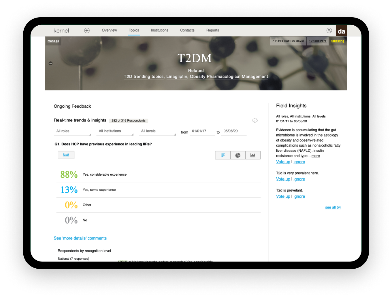
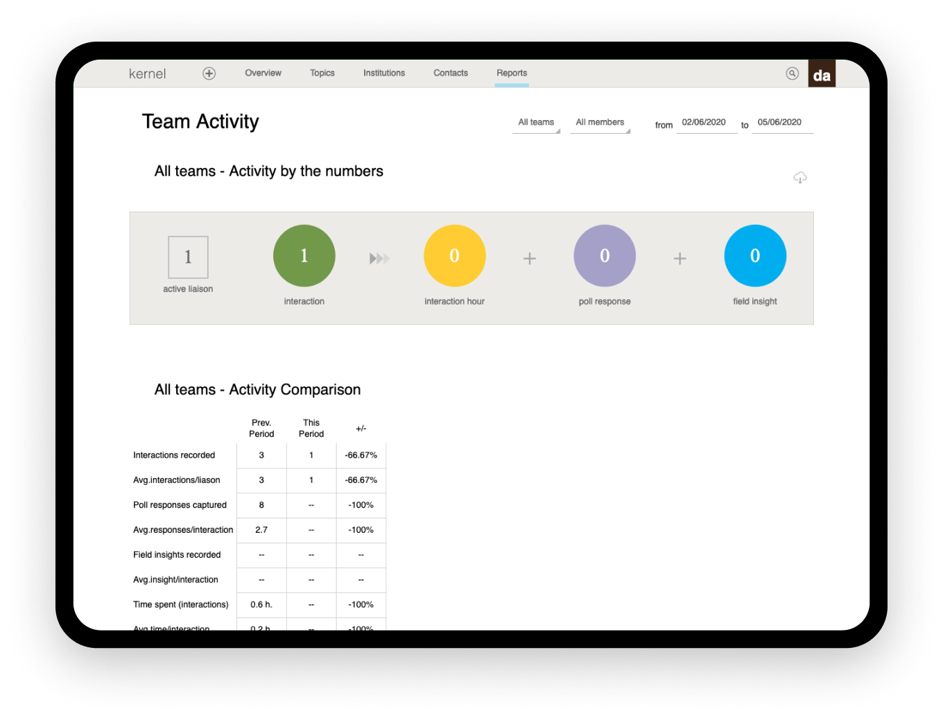
However, regarding the website, there were issues to scale alongside the size and needs of the teams. Fundamental usability was challenged. Several unimportant features and experiments competed for focus. Reliability and performance issues had increased. The website had become impossible to update.

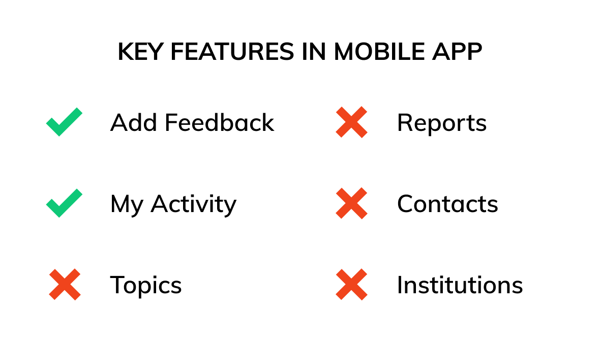
Meanwhile, the mobile app offered an incomplete experience as users were only able to add information from their interactions with the experts.

MSL, THE USER OF KERNEL

A Medical Science Liaison (MSL) is a role within the pharmaceutical and other health-care industries. They discuss with physicians about products and data so physicians can choose the best treatments for their patients. MSLs help to ensure that products are used effectively and bring the expert feedback to the pharmaceutical company to guide future clinical trials and product development.

Kernel Kernel

High Level Goals

MAKE IT ACCESSIBLE

Make it easier to capture insights and embrace diverse contexts: devices, users, locations and situations. The platform must be fast and easy to use for everyone, everywhere.

ENABLE DEEPER ANALYSIS

Give MSLs and Medical Directors the best tools to analyse and more control to adapt the platform to their needs.

CREATE A STRONG FOUNDATION

We weren’t trying to revert to a simple platform. Rather, our ambitions were to create a platform for innovation that would allow us to continue its development embracing modern technologies.

My role

I worked alonside a product owner. I was responsible for the experience extrategy and design of the website, mobile and tablet apps. We worked together iterating with the designs, confirming assumptions with users, and ensuring a good implementarion working closely with developers.

WORKING REMOTELY

Everyone at Kernel worked remotely. I was in Barcelona while the rest of the team worked from America and Europe.

EXPERIENCE STRATEGY AND VISION

I created frameworks and prototypes to share the vision, design principles and content strategy. This helped to evangelise ideas, gain alignment and drive decision making.

CUSTOMER INSIGHTS AND IDEATION

I partnered with the product owner to uncover insights and translate concepts into features that address customer behaviours and motivations.

DESIGN EXECUTION AND VALIDATION

I designed for iOS, Android, iPad and Web. I executed journeys, wireframes and design specs.

PLANNING AND SCOPE DEFINITION

Together with the product owner, we defined the product. I prioritised and negotiated features for launch and beyond. I evangelised customer goals and balanced business goals.

GETTING SUPPORT

I presented the designs to gain support within the team and helped the Sales team to gain buy-in from both existing and new potential clients throughout the project lifecycle.

Early insights

At the outset of the project I didn’t have a clear mission or specific goals for the experience of capturing and analysing data. We had some understanding of some of the problems existing with Kernel website but we decided to explore more and validate our assumptions.

We tested the existing Kernel website and app with 8 participants of the MSLs teams that were already using Kernel. Our goals were to understand the challenges MSLs faced and the workarounds they employed.

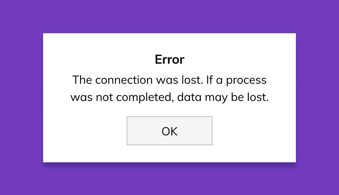
LOSS OF INFORMATION BEFORE SUBMIT

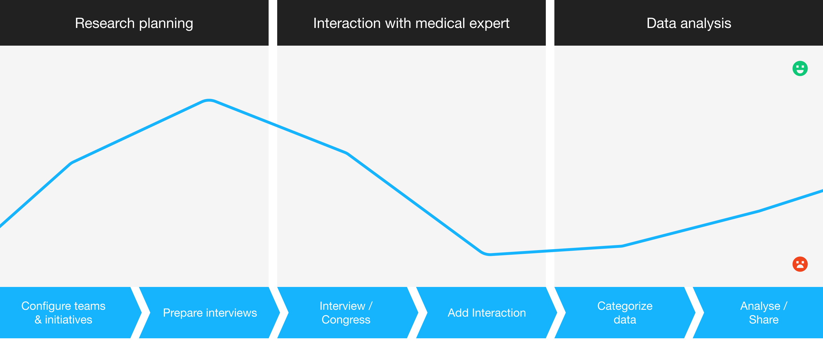
MSLs took time to add the insights and some could get pretty large. They were fustrated that if they cannot finish, the progress was lost. Some users took notes outside before adding anything to Kernel.

kernel-add-feedback-error

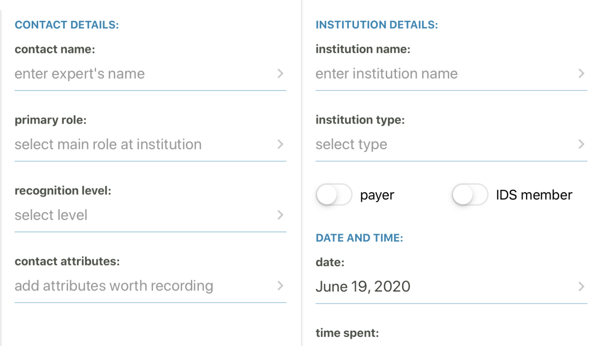
TOO MUCH METADATA TO ADD

MSLs wanted to add the information faster and without errors. However, insights have lots of metadata about the interaction with the expert. They expected Kernel to be smarter.

kernel-add-feedback-metadata

INCOMPLETE MOBILE EXPERIENCE

Mobile is the only choice in situations in which MSLs were away from their laptops. They were annoyed to enter into the Kernel website in mobile. They expected a native app with the whole Kernel experience.

kernel-mobile-experience

MSL expectations changed over time

It became clearer that MSLs expected Kernel to be smarter, help them in multiples ways and with minimal effort. As Kernel became more integral to their workflow, their expectations evolved. Users were taking Kernel where we didn’t expect. Curiosity revealed an opportunity to perfect the experience.

Deeper Insights

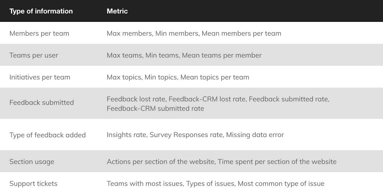
I partnered with our data analyst to investigate how MSL teams were and how it was their experience at scale.

The first goal was to validate the existing information architecture so we can build an experience that works best for most users but considers edge cases too.

The second goal was to investigate the health of adding insights around all teams. What was the perfect example of an interaction with a medical expert? The Add Interaction form asks MSLs to add free text Insights and/or respond to previously defined Survey Questions. Users could add none or multiple of each, from different Initiatives.

Kernel metrics

GREAT VARIETY OF TEAMS

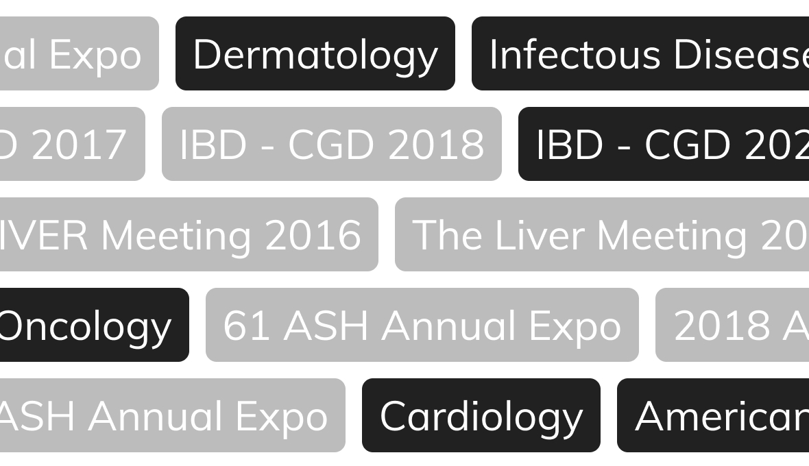
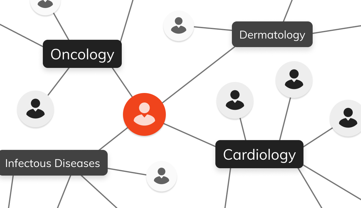
Digging into the data revealed insights about how companies, teams and the content were organized. There were a great variety between teams sizes, number of initiatives. We also discovered how some users were part of different teams and different ways to use Initiatives. For example, MSLs created new Iniatives for Medical Congresses that they attended; those Initiatives would be used intensively for weeks and then become inactive.

Data also showed several problems that affected most teams. The overall trend was that the experience was getting worse overtime as teams added more content and had more historical members (although not all were active at the same time).

Many of these problems had a material impact not only in the overall experience but also in the potential results that MSLs could achieve with Kernel. The issues affected them both at adding feedback and at analysing the data.

I have intentionally omitted confidential data here.

INACTIVE TOPICS

MSLs took time to add the insights and some could get pretty large. They were fustrated that if they cannot finish, the progress was lost. Some users took notes outside before adding anything to Kernel.

Kernel

MSL IN MULTIPLE TEAMS

MSLs wanted to add the information faster and without errors. However, insights have lots of metadata about the interaction with the expert. They expected Kernel to be smarter.

Kernel

Reframing the problem

Although the Kernel website was an improvement compared to spreadsheets or CRMs optimized for sales, this wasn’t enough to fulfill MSLs needs. Kernel had important problems: adding and analyse information, navigating trough the website, managing inactive content, allowing team collaboration, a compelling mobile experience... This lead to fustration and wasted time.
Kernel

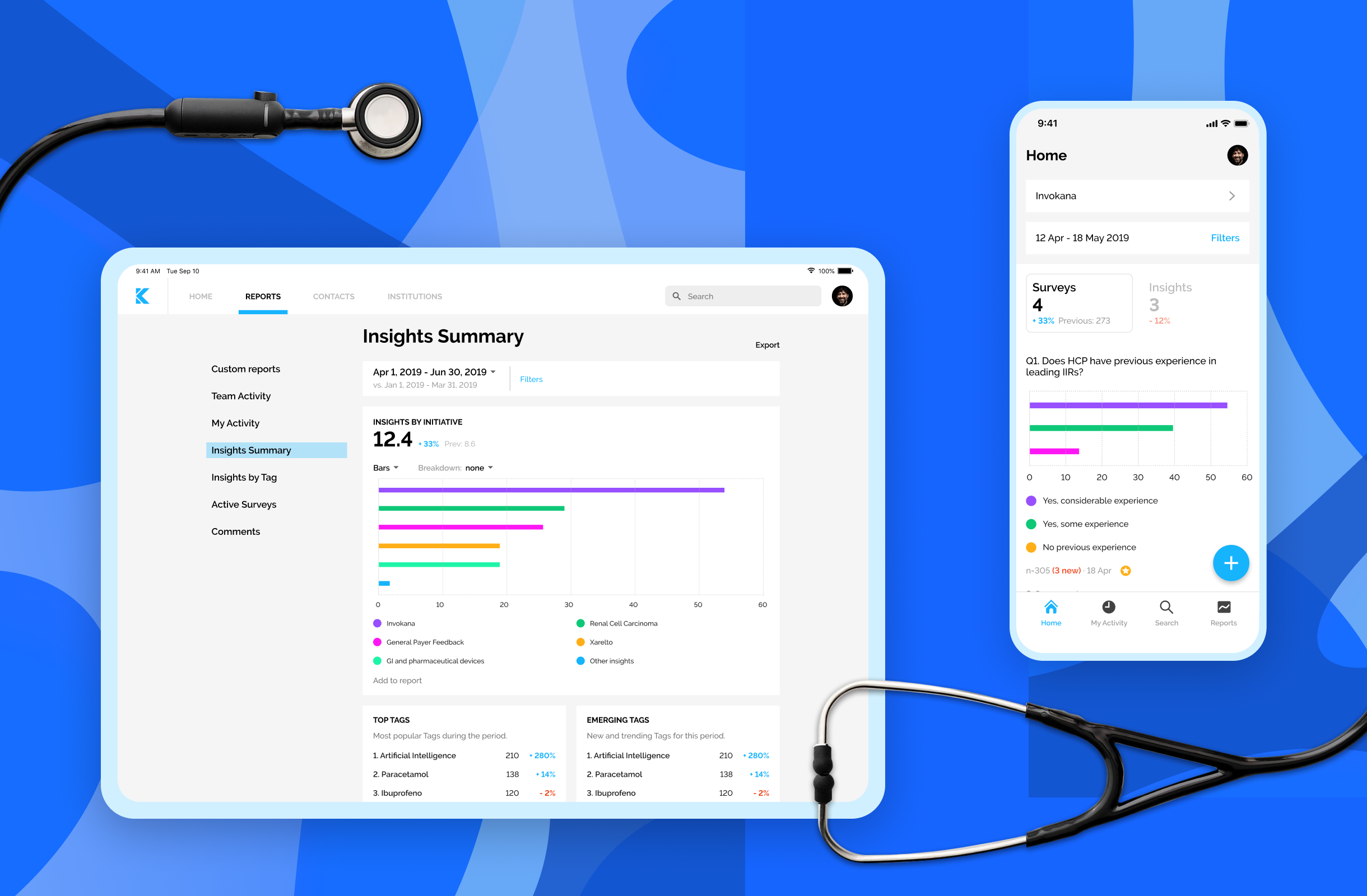
Introducing the new Kernel

Our proposal enables MSLs to add information fast, effortless and calm. It makes sensible decisions for them, informing them in ways that are understandable and actionable.

It also gives MSLs data analysis tools and enables team collaboration within and without Kernel. All of this with a new look and available in web, mobile and tablet.
Kernel

NEW NAVIGATION

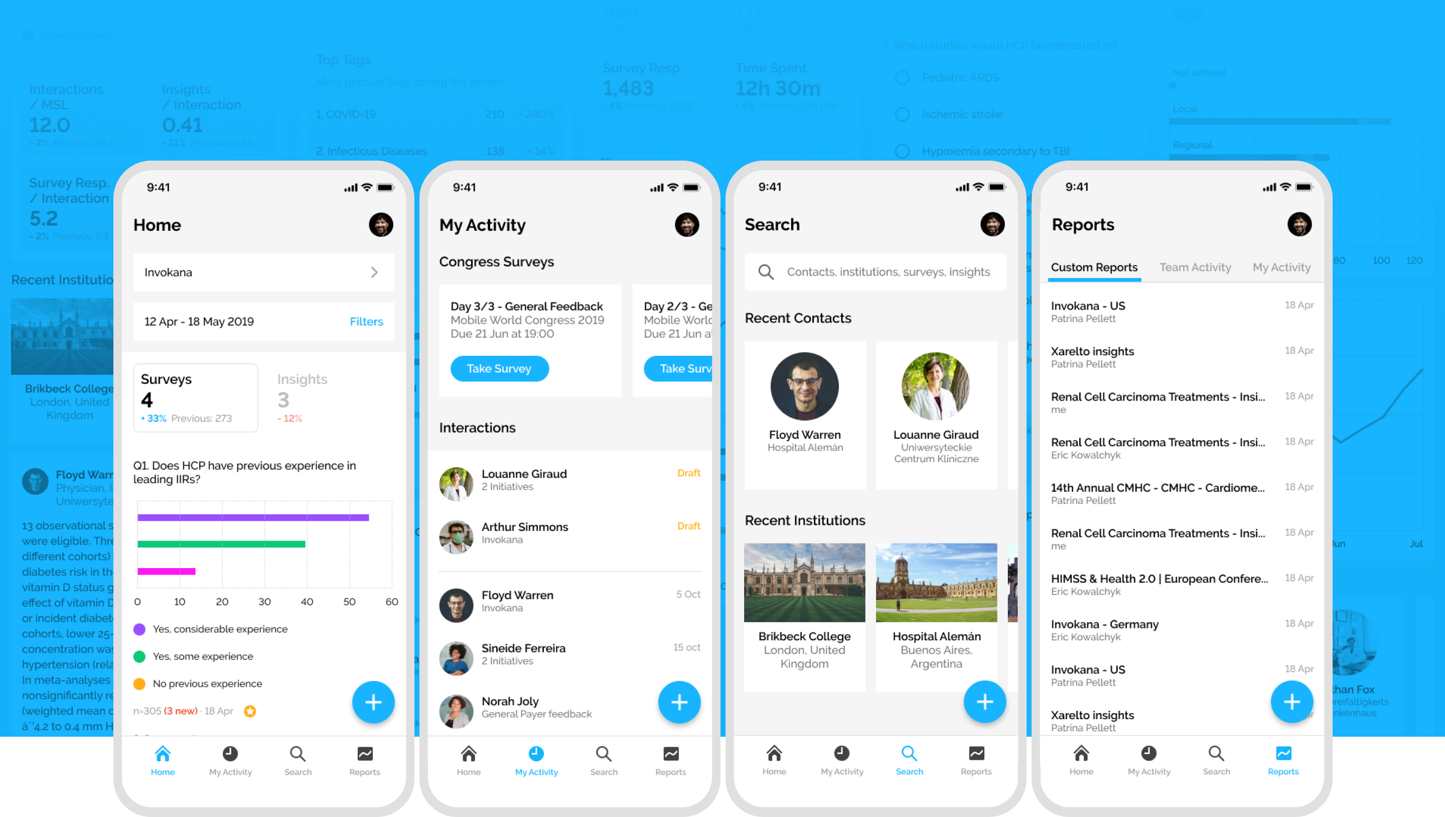
The navigation has been redesigned. It’s easier and it feels simpler because everything is where it makes sense to be. Some terms have also changed for words commonly used in the healthcare industry, like Initiatives instead of Topics.

The information is presented just how MSLs work. The focus is on the information gathered from leading physicians. The structure of the information is refined to enable a quickly scan or a deep analysis.

ADD INTERACTIONS WITH EXPERTS

The new Add Feedback is called Add Interaction, and now it is fast and calm. Unfinished Interactions are saved automatically in drafts to limit the risk of losing any information.

The process is streamlined. Kernel makes sensible decisions for the users, informing them in ways that are understandable and actionable, and enable them to past fast through the most tedious parts.

CREATE AND EDIT CUSTOM REPORTS TOGETHER

MSLs can select any data from Kernel and add it to a new Custom Report. Then, share it and bring up the collaboration with the whole team. Add notes, change the filters, export to PowerPoint and more, always saved and synced.

KERNEL IN MOBILE

The new Kernel brings the whole experience to Mobile. Not only the new website is more accessible on all screen sizes, the new native app for iPhone, iPad and Android offers all the features (except admin tools) adapted to each device.

I'm always looking for interesting challenges and new friends